Thursday 29 March 2018
PRODUCTION- Digipak & Magazine Advert- Final Draft
Digipak
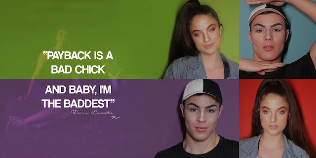
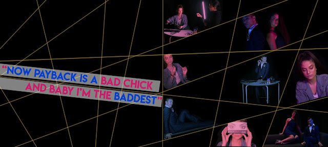
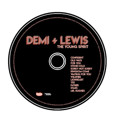
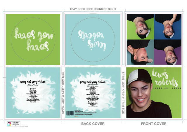
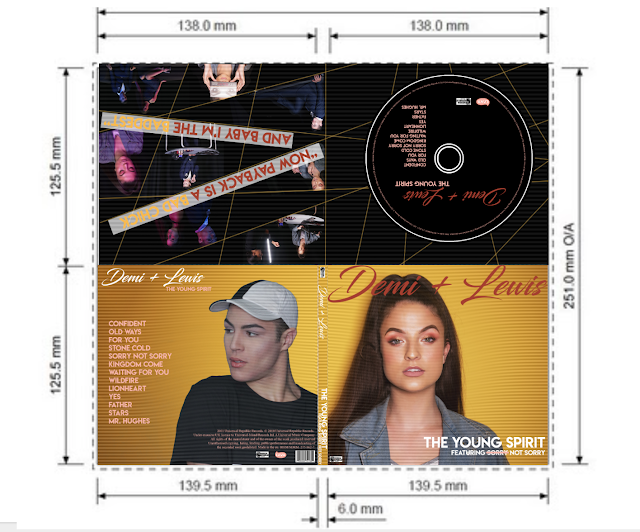
To my inside cover I simply improved it by making the images appear to be moving seamlessly between each other. I removed the harsh line that made the inside disk as well as the inside cover look divided.
To my inside cover I simply improved it by making the images appear to be moving seamlessly between each other. I removed the harsh line that made the inside disk as well as the inside cover look divided.
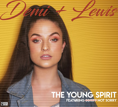
Front Cover
Back cover
Tuesday 27 March 2018
PRODUCTION- Digipak and Magazine advert design
Front Cover - I have kept the front cover simplistic yet eye catching using a bright pastel green as the background. The model is wearing modern clothing that my target audience wear and the pose makes the model look approachable which is appealing to audiences. The typography is shown to be both sans serif and hand written font. The sans-serif font of the album title 'sorry not sorry' gives a modernised look to the front cover, which is what my target audience prefered in questionnaires, and the handwritten 'Lewis Roberts' gives a personal touch, which attracts people as they believe the artist has put more care into the product. I edited the photo in order to make it brighter and have the colours within his face stand out more. I used the properties of brightness and curves in order to do this and believe the overall outcome was more effective.
Inside left - In my final design for my inside left panel, I have used multiple pictures as in the questionnaire my audiences said that they prefer to see more photos. Again I edited the photos using the curves and brightness properties within photoshop in order to make my photos more visually appealing and the colours more vibrant. I used no text on this page as I wanted to answer my target audiences questionnaire responses and keep text to a minimal without the digipak as it can become visually unappealing. I have also carried on the colour scheme of using background colours on the blue and green spectrum as too keep with a house style.
Disk panels - As I have created a six panel, I wanted to create a deluxe album that had two disks within in. Each page was a different colour, either pastel blue or green, to keep to the colour scheme that has been carrying throughout the digipak. I also use the same handwritten typography as used on my front panel to keep up the personalised style, this time however both the artists name and the album title are in the handwritten font.
Back panel and fold Panel - These two panels are taken up with the song title on both the normal disk and the deluxe disk. These have the most text on throughout the digipak however it is neat and centered and is still visually appealing to the audience. The typography is a vary between the sans serif font and the handwritten font on the front cover and also another handwritten font that I used on my magazine advert. The variation makes the song titles easy to read as I kept the simplistic sans-serif font for them but made it more interesting to look at with the handwritten fonts at the top of the page. I also used the smudge tool in order to create an interesting an original shape for my audience to see whilst looking at the tracks.
Editing - As mentioned before, I used the properties brightness and curves in order to edit my photos. I started editing each photo by increasing the brightness to make the skin of the model have more of a healthy glow to it. I then clicked on the curves option and did different alterations in order to get the best overall colours to match my house style of being bright. I also edited the track list background by creating a white circle within a blue background and rasterised it so that i could change the shape of the circle. I used the smudge tool to create
Thursday 22 March 2018
Monday 12 March 2018
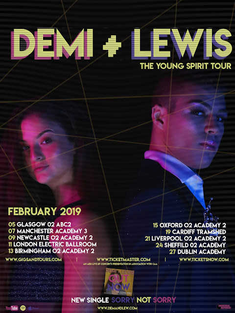
PRODUCTION- Music advert final draft
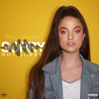
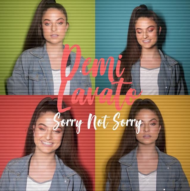
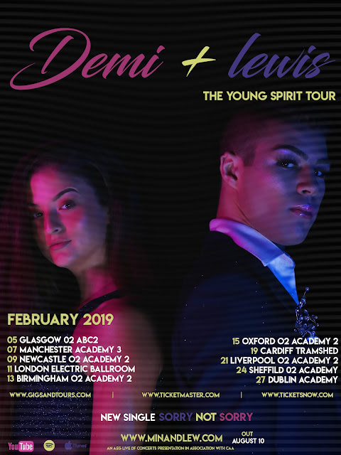
From feedback I have made slight adjustments to my music advert. I have added TV scan lines to make it more relevant to the music video. I have also coloured the SYCO logo to make it fit with the yellow on the bottom of the page and I have moved the headline 'sorry not sorry' under the artists name to make it fit with the front of my digi-pak.
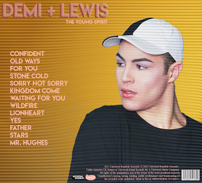
PRODUCTION- Digi-pak back final draft
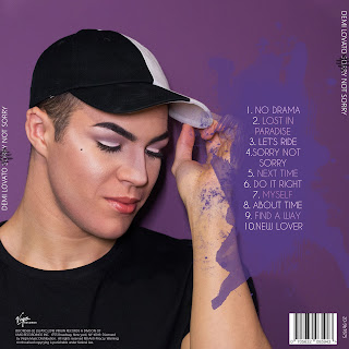
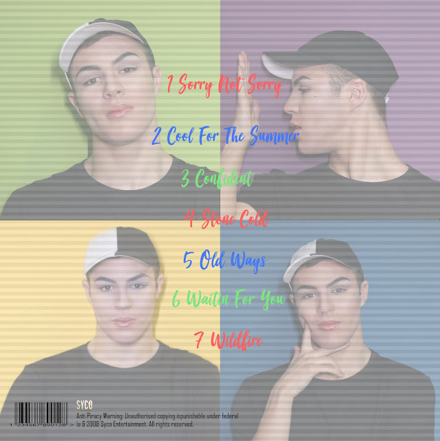
From feedback I have made slight changes to my digi-pak back. I have added scan lines to make it fir to the theme of the music video. I have also added a copyright and logo of syco which is the music company. I have also taken out the heading 'track list' this is because the target audience would know this and it is not relevant for the back.
PRODUCTION- Digi-pak inside back final draft
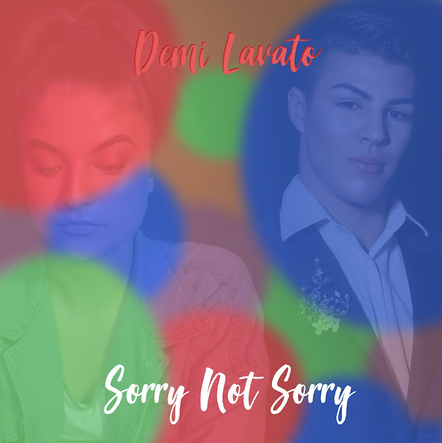
After receiving feedback I have made slight edits to my digi-pak inside back.I have faded the colours to make them more similar to the music advert. I have also changed the colour of the font to do the same. I have added images of the models to make it fit with the overall style of the digi-pak.
PRODUCTION- Digi pak inside front final draft
From feedback I have slightly changed the inside front of my digi pak. I have removed the title to make it look more professional.
PRODUCTION- Digi-pak front final draft
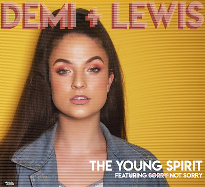
After receiving feedback I have made slight edits to the front of my digi-pak. I have used scan lines to make the image appear similar to the effects used in the music video.
Wednesday 7 March 2018
Subscribe to:
Posts (Atom)
