Monday 12 February 2018

PRODUCTION- - Digi-pak and Music Advert

To get a better idea of what my digi-pak and magazine advert would look like I printed them off and assembled them in order to see what it would look like.


PRODUCTION- Digi-pak Back

Here is the back cover of my digi-pak. Like I planned I have had the tracklist on the back with all of the songs in different pastel colours to ensure it is bright and colourful. I also said I wanted to use something different within the back which is the model. The main artist is a female who sings the song however for the video we have used a male and a female. Although this is a album I wanted to use the model Lewis to create some advertisement on the video which will make the target audience intrigued. Like I have said in my plan, my questionnaire results show that my audience are more attracted to images, these images will do that.
Although in the plan I said I was going to put the companies involved on the back I decided to do this on the front as it is what more people will see and read and will advertise the company more than if it was on the back.

I believe this will attract my target audience as I have used multiple images and used bright colours, this was feedback I received in my questionnaire that I have used.

Below is my original layout design for my digi-pak

PRODUCTION- - Digi-pak Inside Back


Below is my final inside back for my Digi-pak. Like said in my layout design I have kept it simple and have used bright pastel colours. I have blurred the background to make the artists name and album standout. I have also drawn a template of the CD to see how it would look when the CD is in the cover. 

I believe I have attracted my target audience by using pastel colours which I found my target audience liked from my questionnaire. The font is big and bold and will attract the audience. Moving forward I would consider putting an image on my CD as from my questionnaire results I have found that my target audience respond better to images than typography.


Below is my original layout design for my digi-pak


PRODUCTION- Digi-pak Inside Front

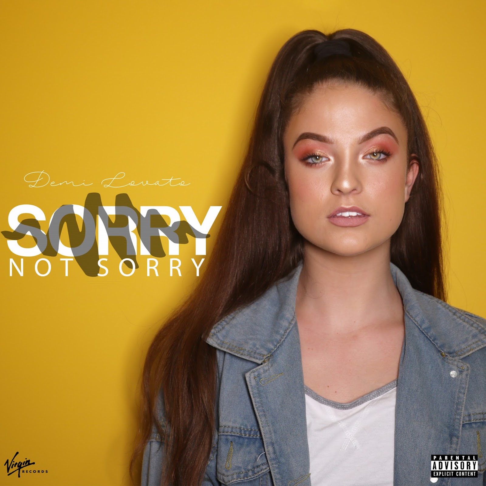
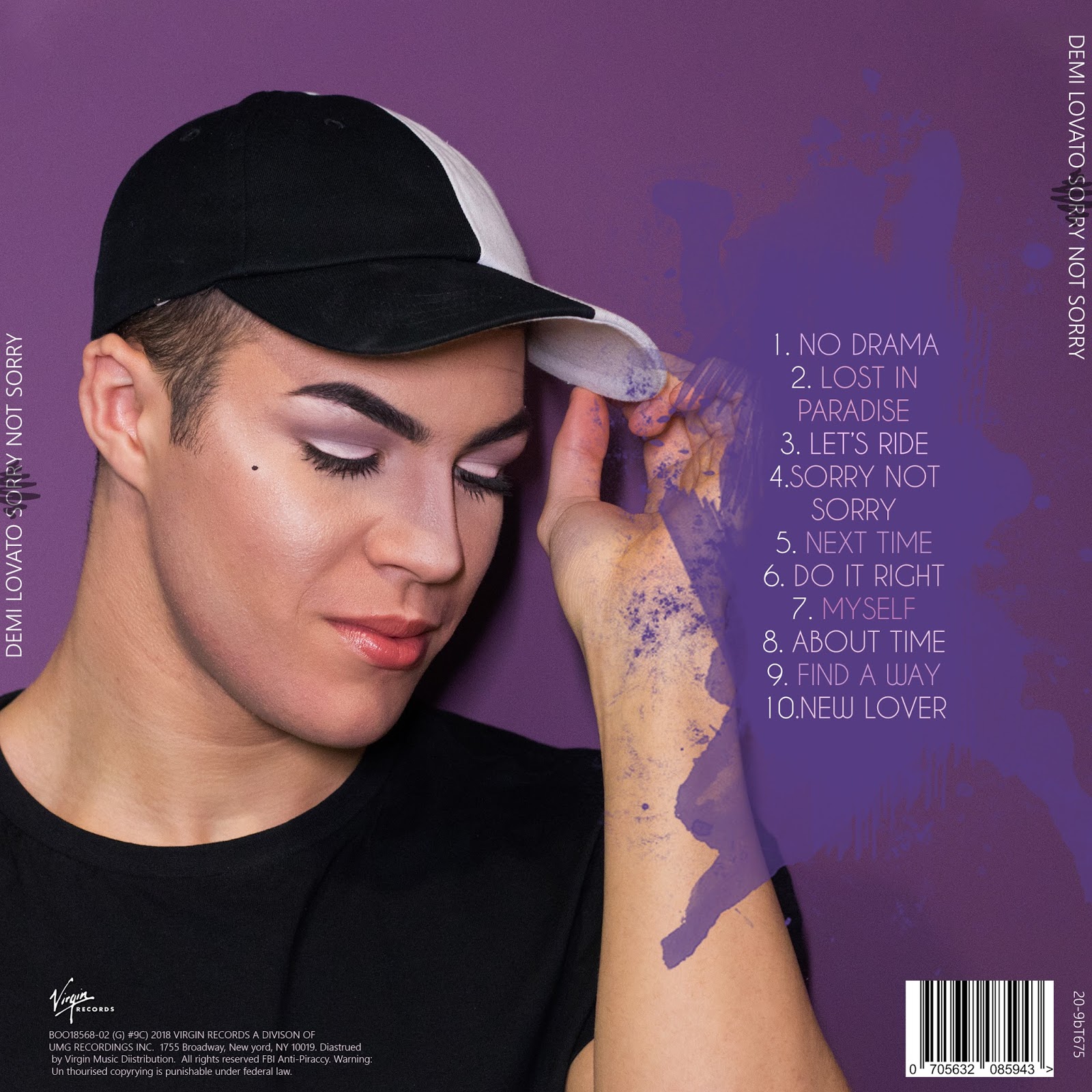
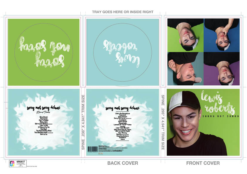
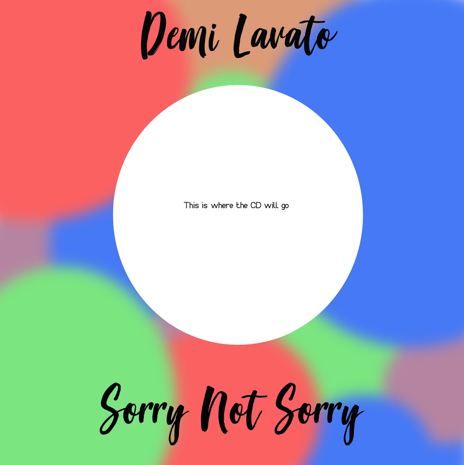
Here is the final version of the inside front of my Digi-pak.
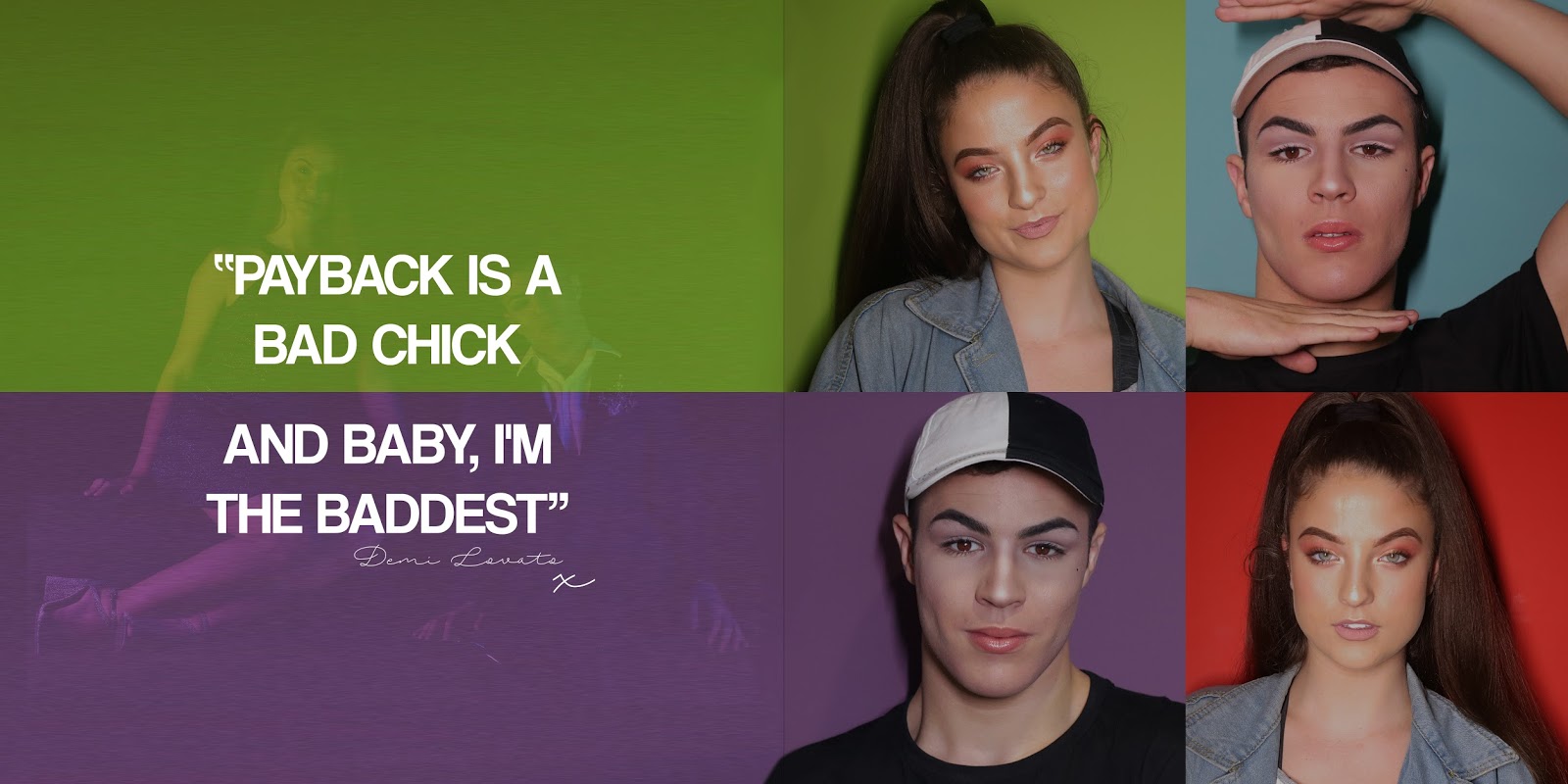
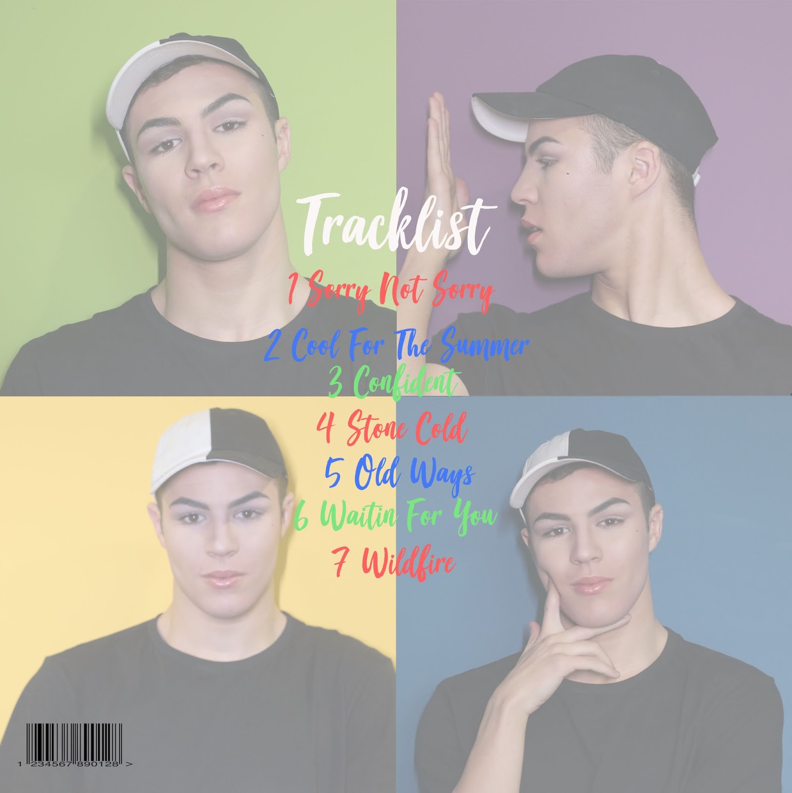
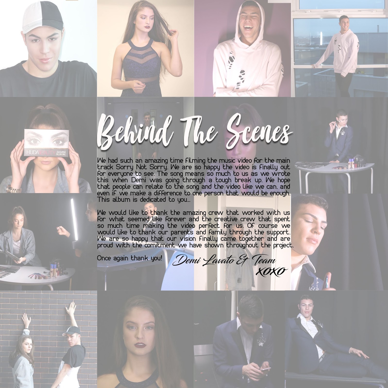
On the plan I planned to have many images as the feedback from the questionnaire was that the audience want to see many photos not just one. After filming this lead me to look at the images I had taken and use them for this page to show a behind the scenes to give the audience an inside look to filming. I also wanted to include a message from the artist as this is something that is exclusive if the digi-pak is brought which means the target audience will be more intrigued.

After using a guide to ensure I evenly spread the images across the page I decided to fade the images to make the writing stand out and not look over crowded.

I have attracted my target audience by using loads of images (which, from my questionnaire I found they preferred). Using a personal message from the artist is exclusive and is also something that would attract my target audience.

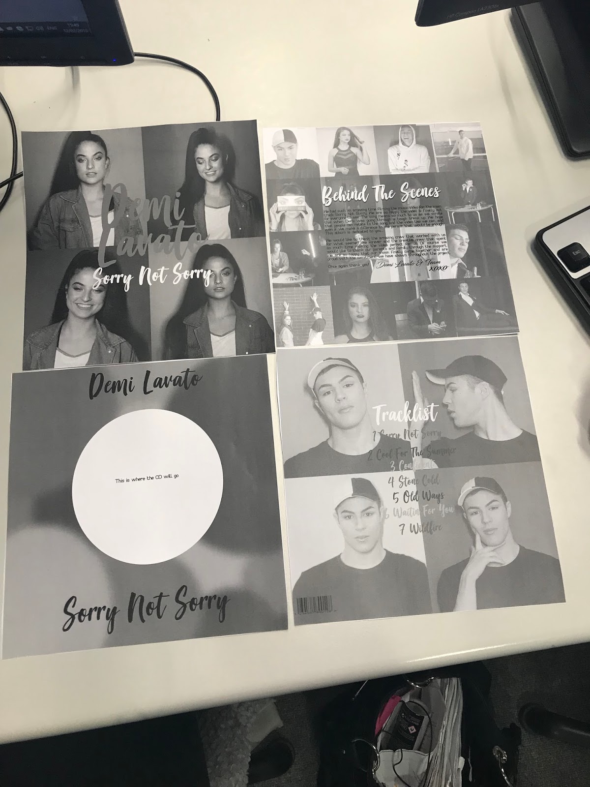
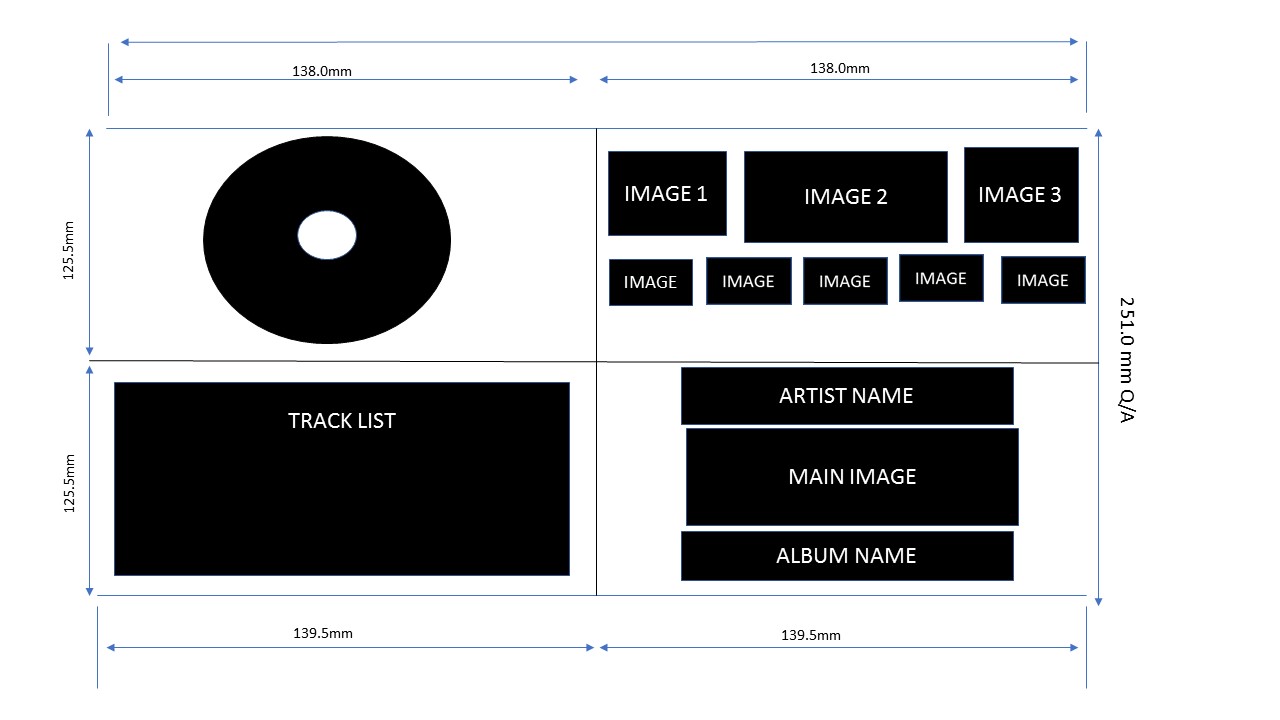
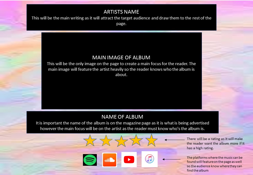
Below is an image of my original layout design for my digi-pak


PRODUCTION- - Digi-pak Front

Here is the final version of the front of my Digi-pak.

I decided to use more images as it was more eye catching and colourful which was my main intention. The main model is wearing fashionable clothing which is also something I aimed for. The typography is eye catching and keeps with the overall theme of the digi-pak which is fun and playful. I wanted to keep the front cover simple on my layout and I believe it looks very simple to a viewer. It is eye catching and you can see the artists image and name straight away which is great for the target audience.

After editing the photos I used a guide to make sure the images were even across the page.

I have attracted my target audience by using serif font and making it bright bold and colourful. As well as the font being colourful, the images are also which again makes the image stand out. It is also very simplistic and clear for the audience to see.


See below for an image of my original plan for my digi-pak


PRODUCTION- Music Advert

Here is my final Music Advert.
Like said on my plan I have the artists name on the top of the image as well as the album name at the bottom. I have included star ratings and social media. The background is bright pastel colours to match the questionnaire feedback I received during the research and planning section of the video. I have also added a website name and the record label also as this is something seen on adverts as it creates excitement about the product and is used for advertisement.
I have edited the background out of the original photo to place it on the pastel colour background. The photo shoot was done during filming.


See below for my original layout plan for the music advert


Monday 5 February 2018

PRODUCTION- production log - camera 05.02.2018

This week we did got our final pieces of footage to fill the blank spaces within the music video. We recorded in a new location and lighting so that we could keep the music video looking interesting to watch. Within this recording session, I attempted to use many different camera angles in order to create a more interesting video to watch. From previous shoots, I have tried to create more focused videos that have clearer features within the models faces as in some previous footage and pictures, the camera is slightly out of focus.

We mainly strayed away from the shot list and script within this shot as we wanted to
After watching the initial draft, we changed the shot list as to make filler shots within
what we've done so far, further creating the story line of causing trouble.

The footage from this session can be found here:

Sunday 4 February 2018

Hennesha's Update on Digipak and Magazine


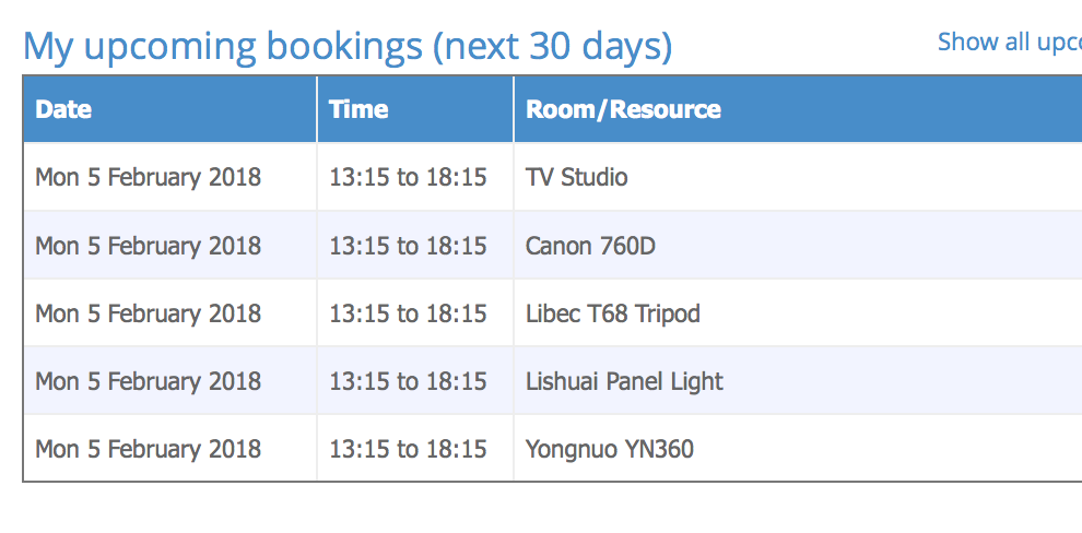
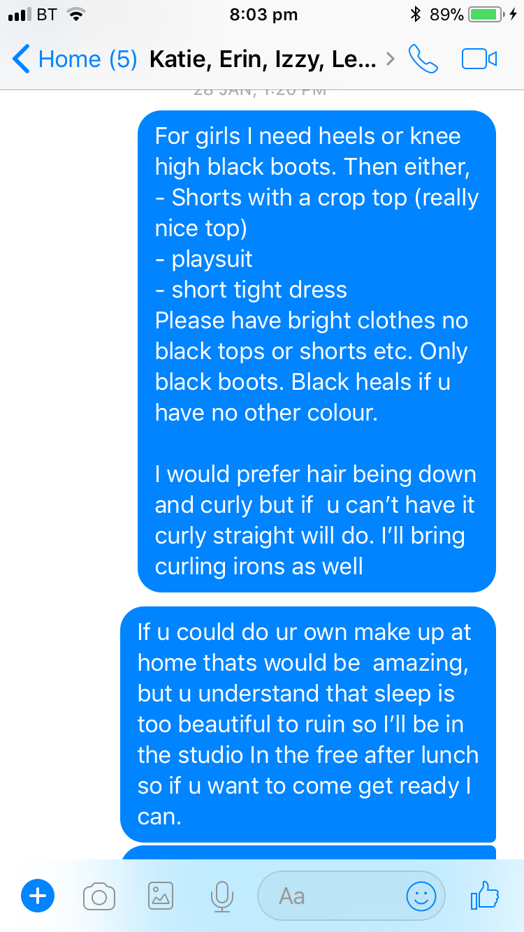
I have asked my artists to get to gather to have a photoshoot so i can have the images i need for my and magazine. i also realised that there is some footage that needs to be filmed for the music video and so i booked out the equipment mainly for my photoshoot and some extra equipment just incase we needed to film for the music video.


I suggested the out fits that i needed them to wear however, i slightly change it when i realised that we were only going to have the two models (minnie and lewis)

I have asked lewis to bring an all blue suit with a silver brooch and for Minnie i will be bringing a blue dress and silver shoes. I will be having the make up similar to how Dannit has been doing it for the music videos. I believe this will conform the conventions of a pop genre.


Friday 2 February 2018

PRODUCTION- Editing Blog 4

After creating a new script, shot list and schedule. The film crew went to Digbeth and filmed. However the bridge that we were going to have some things shot by was blocked of so they had to film in an alternative location. When looking through the footage that i was given, i realised it did not match up to the shot list that i provided for varies reasons. One being how two of our artists could not make the shoot day. Therefore i did struggle to edit as there was not as much footage that i could use. Due to this i realised that i am going to have to create a new shot list which follows a different narrative due to the circumstances we have been placed in. I have thought that we could have a new narrative could be this.
- both people are fired
- they then become friends
- they get revenge on the company that they are from. This works and relates to the lyrics "sorry not sorry"
- they leave the building and are happy and begin dancing together, which shows there relationship.

We are going to have to film a lot the week beginning 05.02.18 as there at the moment is not enough footage for me to make a full video. I am going to have to put in a lot of extra time in next week to edit the footage i am given as the deadline is on the 09.02.18, and if i do not get all the footage needed i may have to look into how i could repeat some of the footage in order to create a good music video.


Here is also the link to the videos and photos that i have been given